Color Psychology: Choose ribbon colors that align with your brand's identity and messaging
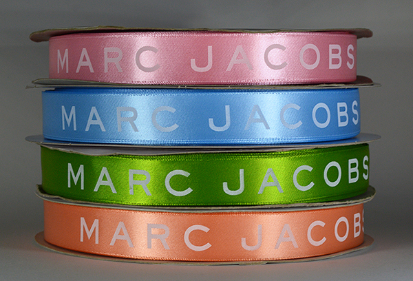
Color psychology plays a crucial role in branding and marketing strategies. It involves understanding how different colors evoke specific emotions and perceptions in order to effectively convey a brand’s identity and messaging. When choosing custom logo ribbon colors for your brand, it is important to align them with the desired emotions and perceptions you want to evoke in your target audience.
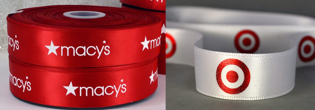
 Colors have the power to influence our emotions and perceptions. By strategically selecting custom Pantone matching ribbon colors, businesses can enhance their brand’s messaging. For example, red is often associated with passion, energy, and excitement. If your brand aims to portray a bold and dynamic image, incorporating red ribbons into your packaging or promotional materials can effectively convey this message.
On the other hand, blue is commonly linked with trust, reliability, and calmness. If your brand focuses on providing dependable and peaceful experiences, opting for blue ribbons can help reinforce these values. It is important to consider the cultural implications of colors as well. For example, in Western cultures, white symbolizes purity, cleanliness, and innocence, while in some Eastern cultures, it represents mourning or death. Therefore, considering the cultural associations of colors is imperative when choosing logo ribbon colors for your brand.
Understanding color psychology and its impact on emotions and perceptions is vital for businesses to create a strong brand identity and effectively convey their messaging. By choosing custom logo ribbon colors that align with your brand’s identity and desired emotional responses from your target audience, you can enhance the overall impact of your brand and leave a lasting impression.


